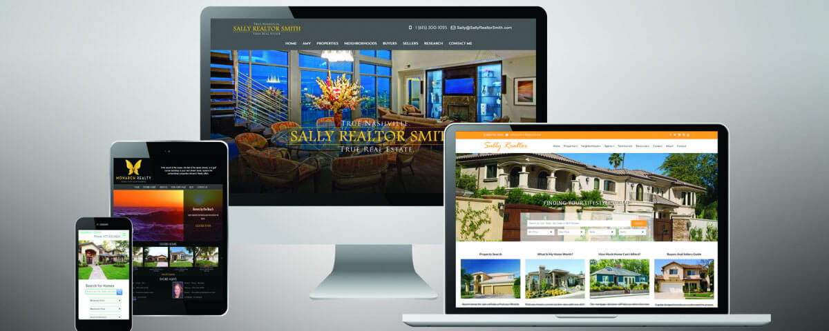
Around two-thirds of Americans are using a Smartphone, with a rising trend. Making sure that all those people can view your website on the phone is one of the most important things when it comes to webdevelopment, design and usability. Optimization of de design of your website for Smartphones is called responsive Design.
Display Contact Information correctly
People are using the phone everywhere, so it is very important to make sure that if they are searching for your company on the go, they can find your address and other contact information easily.
Make sure images are not too big
Data on the phone is usually limited and it takes longer loading a website on the phone than on the computer. So make sure that the filesize of Images (not the resolution of the Images) is small to be loaded faster.
Usability
Making sure that customers can use your website by using intuitive gestures such as sliding will help them to not get confused. Also buttons and navigation should be big enough to click on them easily. There are a lot more aspects that you have to consider when it comes to usability on the phone.
We at GoMarketing are making sure that your website is working on all devices and that the most important information is easily to get to.


